Slide Staircase By Rodney Miller.
It's a staircase... that also has a 27' long slide. Why would you ever want to walk down a flight of stairs when you could slide down? Doesn't matter if you're six, twenty seven, or fifty two, if you had the option of walking down stairs or sliding down a slide, you would choose the slide (and if you don't, you're just lying to yourself). Not only is it fun, the highly polished dark wood makes the slide look pretty darn nice (and it also makes it look like you can go down twice as fast as a normal slide. I mean look at how it shines and tell me otherwise).
Saturday, March 1, 2014
Friday, February 28, 2014
Zack's Looking Out II
Yikes! This fellow is quite good. Sticking with my bathtub theme in this section, I've just found this from Seth Roland Custom Furniture LLC in Washington state.
Looking Out Week 7: Gary Li
Do you think your're an awesome architecture student? Well if you do think again... three students from The University of Seoul designed a "rest hole" in what was originally a parking lot. They cut contours through pieces of plywood and spaced them out evenly to allow light through. The spaces undulate to create a feeling of compression and expansion while moving through the space. We can all hope and dream to have the opportunity to one day do something similar to this. LIGHT, SOUND, CONTOUR, SPACE, WOOD
Ana Mernik Looking Out Week 8
Architect Manuel Aires Mateus recovered two old fisherman huts on the Portuguese coast, specifically a place called Comporta, known for white sandy beaches, wine, and beautiful scenery. The huts are a perfect place to relax and enjoy nature. The 28 square meters offer an elementary kitchen, modest bathroom, two armchairs and a bed, and a terrace overlooking a river. There's also a canoe offered for the guests. The huts are primarily wood, creating an interesting mix of materiality: wood, sand, and water. The project also applies to our current studio Bathhouse project, with humble furniture inside and a shower interestingly placed on the outside facade.
Thursday, February 27, 2014
Looking Out Week 7: Yasmeen Almuhanna
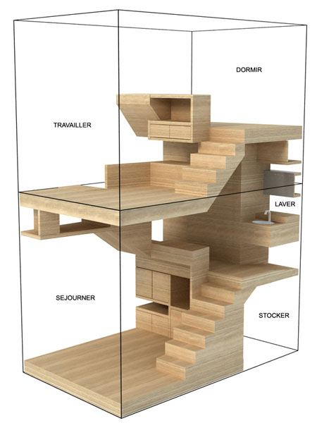
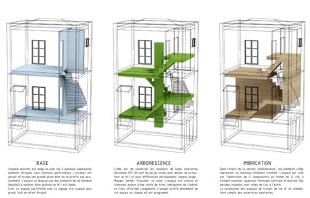
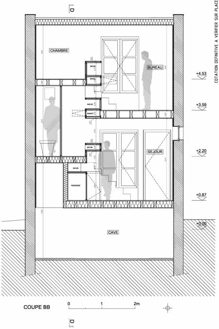
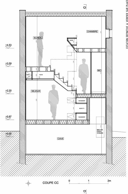
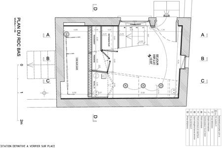
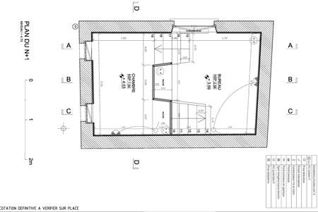
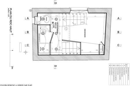
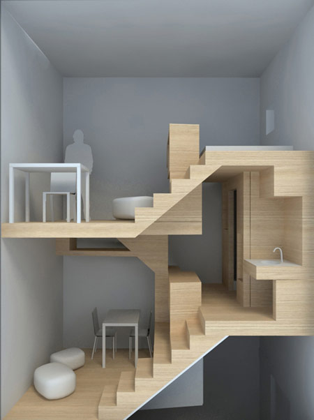
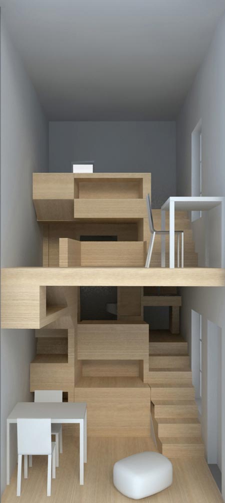
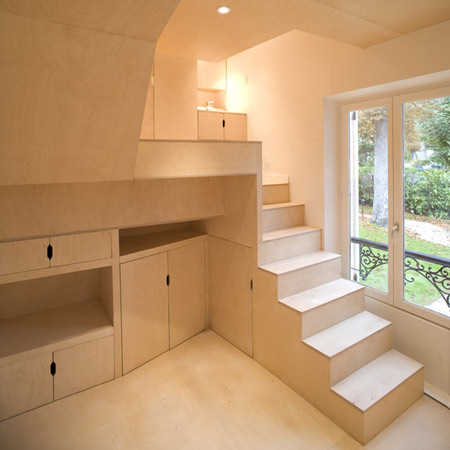
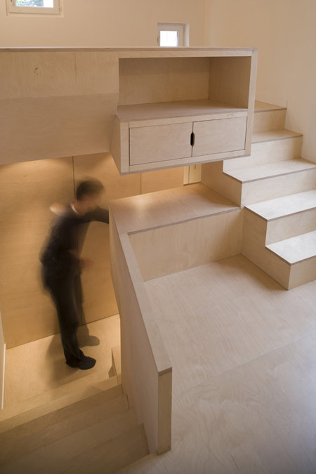
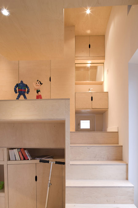
Now here is a project done for one overly privileged teenager. Starting as nothing more than an empty building in the owner's backyard, Paris-based h2o Architects were hired to rethink the empty shed in order to provide a private space for the owner's teenage son looking for independence from his parents.
The rethought wooden furniture forms the entire interior of the house. Made from modest plywood, the furniture allows for sleeping, living, studying, and washing spaces. The lack of kitchen in the program is due to the agreement between the teenager and his parents that meals would still be shared in the family home.
Monday, February 24, 2014
Looking Out Week5: Chang Liu
University
Boulevard Transit Shelters / PUBLIC Architecture + Communication
From the architect. The UBC
campus is full of holes. Some are below ground where construction sites pepper
nearly every corner of campus. Some are at grade where the historic figure
ground is a mixed bag of building forms, dead-ends and disjointed academic
neighborhoods. Some are higher up still, off the ground — floating in the tree
canopy.
The University has been hard at work to address
these gaps in its fabric, spearheading a massive public realm overhaul and
myriad improvements to student life. One of the most prominent undertakings is
at the main entrance to campus along University Boulevard. Small, but integral
to the Boulevard’s redevelopment, are two strategic insertions into the transit
infrastructure that provide covered shelter for a trolley-bus loop. The transit
shelters act as a conceptual extension of the nearby line of Katsura trees.
Slender steel columns are arranged in a staggered line and hold up an oversized
cellular wood structure clad in glass.
From a distance, the glass reflects and fills
gaps in the surrounding trees, but as one approaches, the wood is revealed and
creates the effect of walking underneath branches. The shelters help create a
long covered space, continuing the canopies of adjacent buildings down the
Boulevard into the heart of campus while the sidewalk remains largely
uninterrupted by vertical structure, reducing impediments to heavy pedestrian
traffic.
The shelters aim to create the kind of visual
balance between random and regular pattern that one finds in nature. With the
tree canopy as a starting point, the structural exploration began as a series
of beams, then the beams connect to hold up glass. We sought to imbue that
structural grid with movement and above all, to create a design that performs
both visually and structurally.
Looking Out Week4: Chang Liu
Prayer Chapel By
Gensler
A wave-like wooden ceiling undulates above the heads of students
at this chapel by architects Gensler in the basement of a Los
Angeles university.
Despite being located within the rectangular confines of an
old classroom, the chapel has curved walls and not a single corner.
Architect David Herjeczki explains how he was inspired by the
thick black outlines of poché-style plans. "The design is conceived as a
'heavy' space deliberately set apart from, but fully formed within, the host
classroom building," he said.
Recycled strips of timber were mixed with wood
harvested from olive trees around the campus to create the
uneven finish of the chapel's timber ceiling.
"The choice of such recycled wood is consistent with the
poor and primitive sensibility of the chapel, but materially it provides a rich
contrast to the fundamental nature of the space," said Herjeczki.
A narrow skylight creates a band of light across the ceiling at
one end and illuminated glass blocks create brightly coloured windows
in the curved interior walls, but offer no views to the rooms beyond.
Looking Out Week3: Chang Liu
Sheep Stable by 70F Architecture, Almere, Netherlands
Good architecture is usually provided by humans for fellow
humans. It is a rare occasion when the human being deigns to provide it for
animals too. The city of Almere, Netherlands has a sheep population of about 80
sheep. The sheep are mobilized to keep the powerful weed “acanthus” or
“bears-breech” that grows in the “vroege vogel” - forest and “kromsloot” - park
in Almere under control. To centralize and house this population, a sheep
stable was needed. This is where70F Architecture stepped in.
The stable is designed with an a-symmetrical homogeneous
cross-section. The part of the building where the sheep reside is relatively
low; the high part is situated above the (public) pathway and the hay storage
section, making it possible to store a maximum amount of hay. This shape also
creates a natural flow for the air inside the building, which is refreshed by
two slits at the foot of each long side of the building.
The detailing of the corner of the building, where the
long façade ends and the gable starts, is extremely important for the overall
experience of the architecture of this building. It emphasizes the cross
sectional shape of the building, and finishes the long façade of the building,
which starts as a façade and slowly becomes roof. The construction (pine) and
cladding (Western Red Cedar) are made of wood. Only the curved girders are made
of steel. This was done to emphasize the tube-like shape of the interior, which
would have been less strong using twice as high wooden girders.
The tube has three strategically placed daylight openings,
of which one is close to the floor level, so people can look inside even when
the building is closed. All vertical walls in the stable and office are clad
with beech plywood. The stable is designed to make it possible for the public
or school classes to visit the building and experience the keeping of sheep up
close.
At one end of the building, on the second floor, a room
for the shepherd and a small office is realized. There are sleeping facilities
for the shepherd, who has to stay over night in case any sheep are lambing.
Work in and around the stable will be done by, amongst others, people who live
with a mental social or psychiatric disability, supervised by the shepherd.
Apart from the public function, the Muslim community will be able to buy the
lambs they need for yearly ritual purposes. The building was awarded World’s
Best Pleasure Building at the prestigious World
Architecture Festival Awards (WAF
Awards) 2008
Looking Out Week 2: Chang Liu
Sweden Pavilion
for Shanghai World Expo 2010
As the key words
“Sustainability, Innovation and Communication” cornerstones, the Swedish Pavilion, designed by SWECO, showcases how the
nation’s spirit of innovation solves problems, improves the urban environment
and living standards, and demonstrates the importance of communication under
the new technology situation.
The
pavilion comprises four cube-like structures that are arranged to form a
cross-like space between them — a shape much like Sweden’s flag when seen
from above.The outside walls show a city-like grid; the inside walls are
covered with images of nature. These cubes are connected by elevated walkways,
and house the exhibition,VIP areas, a shop, a café, and a large covered
courtyard — room enough for everyone.
Adhering
to the concept of sustainability, the design of the pavilion emphasizes the
concept of recycling and reuse. The four sections of the pavilion are connected
at an intersection, which symbolizes the harmonious interaction between city
and countryside. Through this crossroad, visitors are able to reach every
section of the pavilion with ease and comfort.
Creativity and innovation
are displayed everywhere in the Swedish Pavilion, inviting people to interact
and think deeply. Visitors can experience Swedish culture, society, engineering
and traditions, which demonstrate Swedish people’s passion for nature and
spirit of innovation.
This three-storey complex
composed of four connected blocks contains an exhibition area of about 1500
square meters, and a number of cafes and boutiques. The third floor includes
the VIP section and restaurants. Visitors can savor Swedish coffee while enjoying
Swedish movies and music. Souvenirs from Sweden will also be available.
Lonking Out Week1: Chang Liu
Lusatian
Lake Landmark
Between
Dresden and Berlin, the largest artificial lake landscape in Europe is
emerging. Lusatia’s lignite fields are becoming the Lusatian Lake Land. The
mighty craters left behind where huge diggers once lifted lignite out of the
earth are now being flooded. A former moonscape is being transformed into a
»water world« of thirty lakes, ten of which are connected by navigable canals.
Right in the centre is the 'Lusatian Lakeland Landmark', an unmistakable symbol
of the future that provides a panoramic view of the lake landscape. its lake
and becoming a 'Lake Town'.
A stark contrast between nature and industry is reflected in the Lusatian Lake Land. Rather than smoothing out this tension, the IBA wanted to highlight it. Needing a tangible symbol, they finally joined forces with the city of Senftenberg in 2005 to hold an architecture competition to design a 'Lusatian Lakeland Landmark': a viewing tower on the Sorno canal between the Lake Sedlitz and the Lake Geierswalde (and between Brandenburg and Saxony) in the heart of the Lake Land, which would also be a sculpture and a symbol for the transformation of the landscape. Out of 145 entries, the partnership Stefan Giers from Munich and the landscape architecture firm Giers from Wettenberg won. In 2008, the LMBV (the sponsor of the project), the city (contractor for the project), and the IBA (project initiator), celebrated its opening together – appropriately enough, in a year with the IBA theme 'Seensucht Lausitz' (a play on 'See' = 'lake' and 'Sehnsucht' = 'longing'). Made from rust-coloured Corten steel, the Landmark is intentionally reminiscent of the industrial origins and history of the Lake land and of steel mining machinery – while the sculptural staircase is a symbol of human achievement and of the future. From a height of thirty metres, its users can see three lakes and the Schwarze Pumpe, Boxberg and Jänschwalde power plants on the horizon.
A stark contrast between nature and industry is reflected in the Lusatian Lake Land. Rather than smoothing out this tension, the IBA wanted to highlight it. Needing a tangible symbol, they finally joined forces with the city of Senftenberg in 2005 to hold an architecture competition to design a 'Lusatian Lakeland Landmark': a viewing tower on the Sorno canal between the Lake Sedlitz and the Lake Geierswalde (and between Brandenburg and Saxony) in the heart of the Lake Land, which would also be a sculpture and a symbol for the transformation of the landscape. Out of 145 entries, the partnership Stefan Giers from Munich and the landscape architecture firm Giers from Wettenberg won. In 2008, the LMBV (the sponsor of the project), the city (contractor for the project), and the IBA (project initiator), celebrated its opening together – appropriately enough, in a year with the IBA theme 'Seensucht Lausitz' (a play on 'See' = 'lake' and 'Sehnsucht' = 'longing'). Made from rust-coloured Corten steel, the Landmark is intentionally reminiscent of the industrial origins and history of the Lake land and of steel mining machinery – while the sculptural staircase is a symbol of human achievement and of the future. From a height of thirty metres, its users can see three lakes and the Schwarze Pumpe, Boxberg and Jänschwalde power plants on the horizon.
Assignment 4: William Aldrich and Chang Liu
For our furniture, we first intended to create a simple shelving unit for the hiker's storage. We decided to locate this in the space for the sleeping and this allowed us to evolve the system into a mixed unit of shelving and beds. The idea created s type of waffle grid, which is usually connected with a simple half-lap. However, to make our system a little more modular and interesting, we have created almost a double-half-lap system where each shelving piece can be taken out/put together separately. At full scale, the pieces would be quite large, this idea lets us break some of them apart, but keep them structurally intact.
The model joint we created was scaled down for us to easily work with it. When it was cut, the final model did not turn out as planned. Two of the pieces seemed to have cut almost the whole way through where it should not have even cut at all. Thankfully, the tabs we left held the pieces together. Unfortunately, this made them fragile and left little room to drill for the bolts. But it was definitely a lesson learned.
Subscribe to:
Posts (Atom)


